-
Architects: Revolution
- Area: 1200 m²
- Year: 2016
-
Photographs:The Black Rabbit
-
Manufacturers: Signify, Subzero/Wolf, Acor, Cemex, Fendi, Lidecom, Maderas Maple, Porcelanosa Grupo, Ralph Lauren, Roche Bobois, Sonos, Teplex

Site
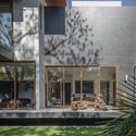
The Project is located in Avenida Paseo de las Palmas, on the west side of Mexico City, in a 800 sqm land plot. The site has an east-west orientation from the front to the bottom of the property. Such orientation helped us organized and distribute the house needs´ program. The area is surrounded by trees, which allowed us to create a special connection between the interior and the exterior of the house. This allows our clients to experience nature even from the interior of the house.

Goal
Our clients are art collectors, so for them it was very important that the house was a space where they could enjoy their art masterpieces. Likewise, they wanted to have a sustainable house that didn’t require the use of electric energy during the day. Therefore, the house is well oriented to take advantage of the sun light and the wind, allowing the latter to circulate naturally. Finally, even though the house had to comply with a specific program that our clients had previously delivered, we made sure everything was aligned with their lifestyle.

Concept
When the clients contacted us to carry out the project, they took us to visit some houses that they liked in order to take ideas of these properties and apply them to our project. There was one of them that particularly attracted our attention, a modern 1950’s house in Mexico. This house contained the entire main program on a single level and only one basement for the service areas.

The layout was L-shaped and was facing a central courtyard / garden. All spaces were transparent and visually communicated. Everything was focused around the garden. Based on such modern architecture, we were asked to make a project proposal that included: mixed double or triple height spaces, high walls for the art exhibition and large windows to allow the illumination to connect with the exterior.

Architecture
The floor plan design is L-shaped, as requested by our customers. We decided to split the house into 3 levels because the program they requested was too extensive to accommodate everything on a single floor. First, we placed the entire public program in the front and horizontal element on the house, which faces the main facade and also connects visually with the garden.

Second, we placed a series of concrete frames with large windows, which provide a sense of spatial fluidity through the house. In the vertical element of the layout, we create a series of spaces based on the flow of communication between them, which make up the family room. Then there is the kitchen and a garden patio that shelter all the areas of the house and serve as a circulation control between spaces. Next is the the bedroom’s lobby, a transition area between the public and private spaces of the house.

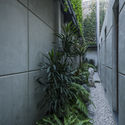
After that, the children’s bedrooms are all connected by a triple height hallway that leads from the left side of the house to a window that communicates with a 14mt height vertical garden, which comes from the basement and runs through the adjacent fence to the roof. On the right side a walnut wood clad camouflages the bedrooms access. Inside, there are three bedrooms with views to the main garden, connected to each other by a linear terrace above a water mirror.

On the upper floor public area, we placed the game and TV rooms, which are spaces practically addressed for guests.This space has a bar and a full bathroom, and has its own staircase, located immediately beside the main access so that guests can have a direct access to the living room without disturbing the house privacy. This staircase has a particular visual detail, as you finish climbing the stairs you find a window that frames a palm tree that is on the other side of the street.

On the same floor but at the other side of the house and isolated, we have the master bedroom, with its own staircase. It covers the 3 bedroom areas on the ground floor.Following the fluid space and connection concept that I mentioned before, this 100 sqm master suite has a 12-meter long window, which is oriented towards the garden and allows our clients to enjoy the outside from the bedroom, bathroom and dressing room.

In the basement we have a six car parking lot with an extension of 12 x 12 meters without any column. The entire public area of the house is located on top of the basement.The structural solution was a challenge as we used a reticular slab and took advantage of the hollow spaces to make a random lighting design with rectangular lamps.Since Revolution's design philosophy is always to provide the best living experience for everyone, we built service rooms with excellent lighting and natural ventilation, unlike most houses in the area.

Finally, we created an interior garden in the basement that serves as a lighting patio for these spaces and creates a great green wall that runs verticality through all the upper levels of the house. This way we play with the house height and broke the modern house scheme with the whole program in a single level, adapting the main ideas and fluidity concept of space and transparency.

Materials
Because our clients wanted to have a contemporary house that reflects simplicity and elegance, this project is made of three main materials: concrete, wood and glass. They chose concrete as the main house material. This was a great benefit to us because this property required large structural walls for the large span house spaces. However, to counteract the concrete coldness we chose a Canadian walnut wood for the floors of the main spaces like the bedroom’s.

For the stairs and the kitchen cover we chose a black marble specially brought from a mine in Spain. The outdoor terraces and patios are covered with Basalt tiles to make an interesting contrast with the concrete light gray color. The ceilings on the outside are covered with walnut.

Also, in the interior we can find a series of American walnut cladding that cover some of the walls in the hall, bedrooms and exterior of the guest´s bathroom. Finally, the rest of the walls are decorated with paintings, sculptures and installations. I would like to emphasize that the house has an intelligent automatic lighting system with a special design to keep all the art intact.


